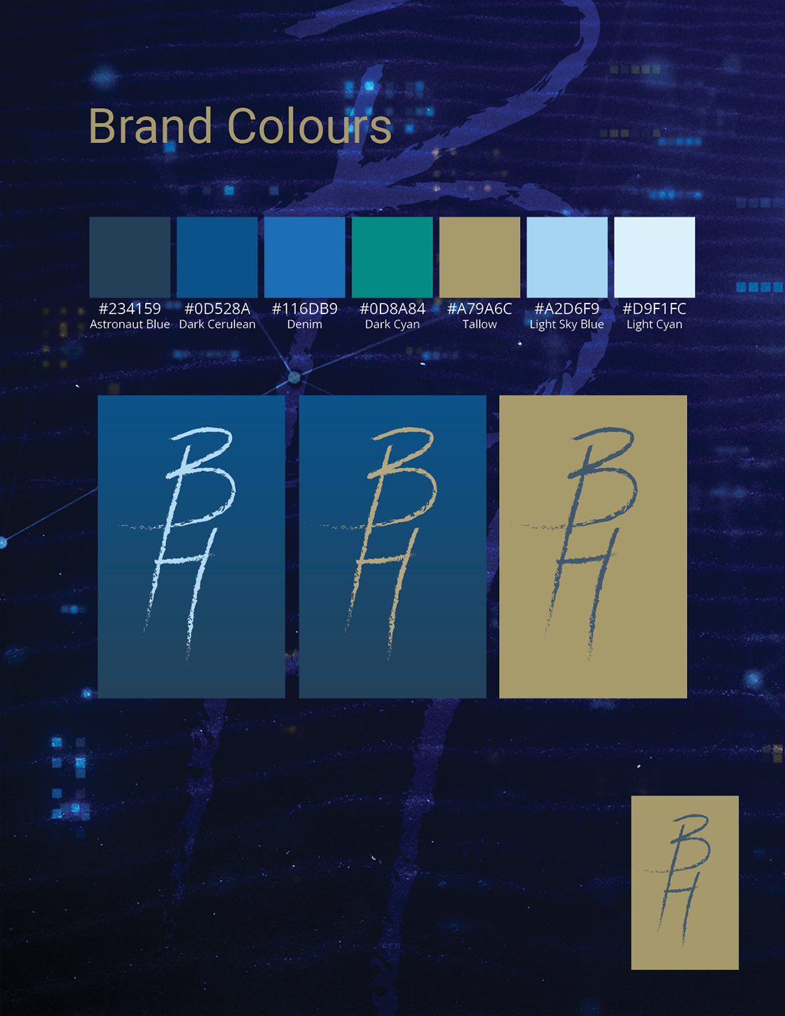
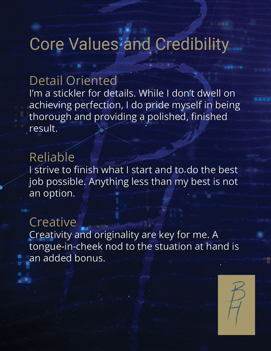
This project was an assignment for my Digital Portfolio Development course. I started by following the guide and sample projects, first creating a logo and choosing colours and fonts. Next, I began brainstorming, choosing a colour palette and experimenting with logos in Adobe Illustrator. Once finished with the initial logo concepts, I submitted what I had for the instructor to review.
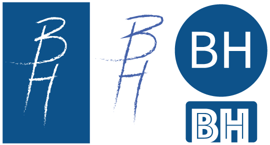
Fonts, colour palette and wordmarks
 I used several different online colour palette generators to come up with a brand palette. I chose the first blue because that colour always speaks to me, and blue represents loyalty and confidence. I then went to Google to find fonts for my typography. I chose two sans serif fonts, since sans serif is easier to read on a screen, and the two worked well together while remaining professional looking, yet not stuffy. Next I went to Pexels to find some sand backgrounds and YouTube to find a futuristic cityscape, which I screen captured to add to my background. The beach is somewhere I feel happy and relaxed, and the cityscape represents how I'm always looking ahead with excitement and anticipation.

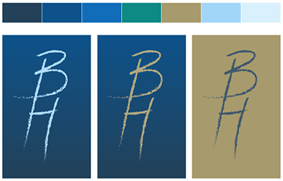


Personal Brand page samples
After choosing brand colours and fonts, I created some background images and began laying out my concept in Adobe InDesign. I experimented with different background collages and finally came up with one I liked. I then added my logo (wordmark) and overlaid the background collage with a colour from my palette. Next, I went about the process of adding the required sections to my brand guide. Finally, I exported everything as an Adobe Acrobat file.
This was my first time creating a document in Adobe InDesign, and I found the process enlightening and educational.
