Customer Journey Map
My goal was to create a customer journey map and user persona, as outlined in the MDIA-2540 UI/UX Strategy course. These would ultimately be used as part of a case study for the course. I didn't feel that the case study itself would ultimately engage readers, due to its length and somewhat dry subject matter. Instead, I wanted to concentrate on the user’s pain points and to showcase a user who was a typical value investor interested in following the investment style of Warren Buffett, as showcased on the Berkshire Hathaway website.
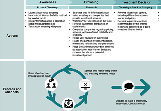
I wanted the journey map to follow the user through his expectations, pain points, goals, actions, and an eventual solution to all of them.
Customer journey maps usually follow the same general formula, so I adjusted my findings to follow that formula. I then went to the royalty free websites Unsplash and Pexels to find the appropriate image of a middle aged man who might invest through the Berkshire Hathaway website.
User Persona
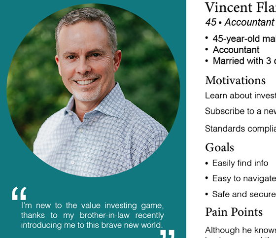
I began thinking about the type of user who would interact with the Berkshire Hathaway website, the pain points such a user would have with a site as outdated as it is, and the improvements necessary to make that user comfortable moving forward.
As I began looking for suitable persona templates, I discovered nothing really exactly fit my expectations so I created my own from scratch. The finished result can be viewed by clicking the image to the right.
Wireframing and prototypes
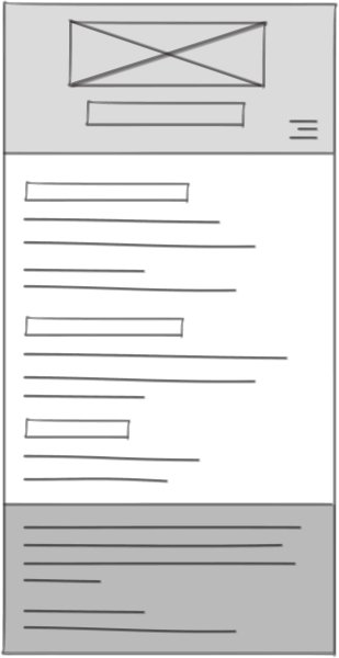
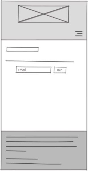
Once I had the user persona and the customer journey map finalized, I moved on to wireframing the site, and then creating page mockups.
The mockups were taken into InVision app where they were made interactive, and then put through peer review.
This prototyping phase showed me the shortcomings of my design and suggestions from my peers helped me to improve things greatly. Making the pages interactive also shed light on some areas that needed improvement.
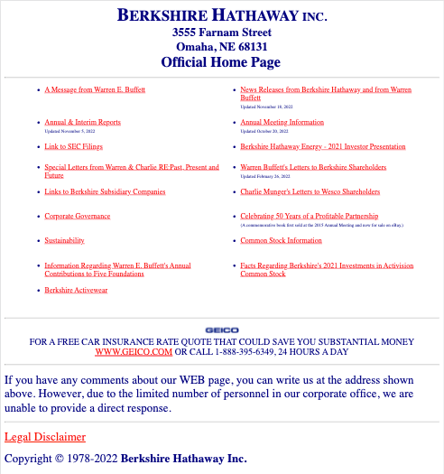
In the end I feel I came up with a design that greatly improved upon the existing one, without compromising the intent of the original.
While the new design could have been more colourful and interactive, I felt that keeping the spirit of the original was important, especially considering its age and reputation. I tried to instill a simple elegance while bringing the site's design into the present. Adding bells and whistles felt like the wrong approach. Decoration for its own sake felt insincere. Instead, I opted to be more iterative and to ease users into an even newer design after having the same look and feel for literally decades. Once the new design is accepted, then it's time to add extra functionality and design acrobatics. Until then, comfort and familiarity is key.
